An update on our new website design
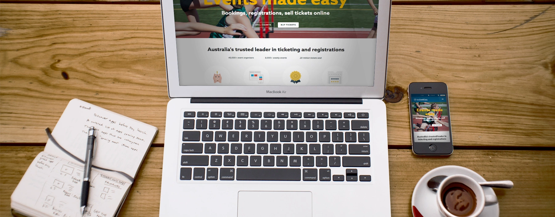
This week we are proud to release an updated website with a new look and feel and a host of changes that will help users navigate the site more smoothly. If you look around you will notice new colours, a new logo and a new design that is mobile friendly. Here is a quick overview of the changes, we hope you like them. Please let us know what you think on social media and tag us. @trybooking #trybooking
Look and feel
We have added some design elements such as icons, updated the brand colours and added a new structure. You should that is easier to navigate around and learn more about TryBooking.
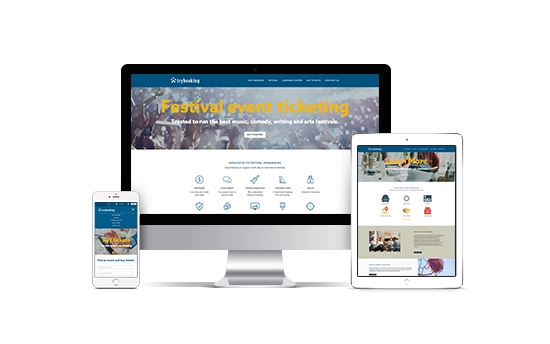
Key pages include:
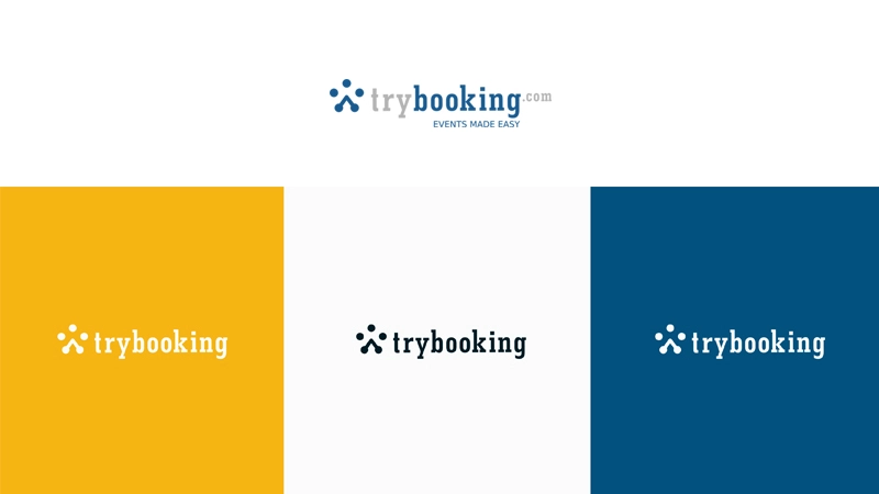
New logo
The TryBooking logo has been evolving slowly over the past seven years. With this update, the most noticeable change is that we have dropped the .com from the logo. We haven't moved anywhere, you can still find us at trybooking.com
If you need to download our new logo or buttons to promote your events. Head over to the brand page and download the brand folders.
This image shows the past logo and the new versions below.
We hope you like the new design. If you have any feedback or want to suggest anything at all you can let us know via facebook, twitter or send us an email - info@trybooking.com
Good luck with your next event.
Events made easy
The TryBooking Team
How to create better events and worry less about user access with these features
Jul 22, 2016 · 2 min read
A few tips to organise better events
Jul 19, 2016 · 4 min read
You might also like

Introducing TryBooking Box Office App Tap to Pay on Phone
Apr 01, 2024 · 1 min read
How To Market Your Event
Jan 15, 2024 · 1 min read
How To Run An Event In 2024 - Everything You Need To Know
Jan 03, 2024 · 1 min read
How to boost your branded event page
Sep 29, 2023 · 1 min read
125 Unique & Fun Event Ideas For Your Next Event
Mar 20, 2023 · 1 min read
How to Create an Event Program
Mar 13, 2023 · 1 min read
10 Corporate Event Ideas To Ignite Some Fun At Your Office Party
Mar 17, 2023 · 1 min read
5 Ways To Spruce Up Your Event
Sep 27, 2022 · 1 min read
How to Plan a High School Reunion
Apr 05, 2023 · 4 min read
Yoga Classes Come In Many Forms 🧘♂️
Mar 11, 2022 · 1 min read
How to customise your Homepage?
Aug 20, 2020 · 1 min read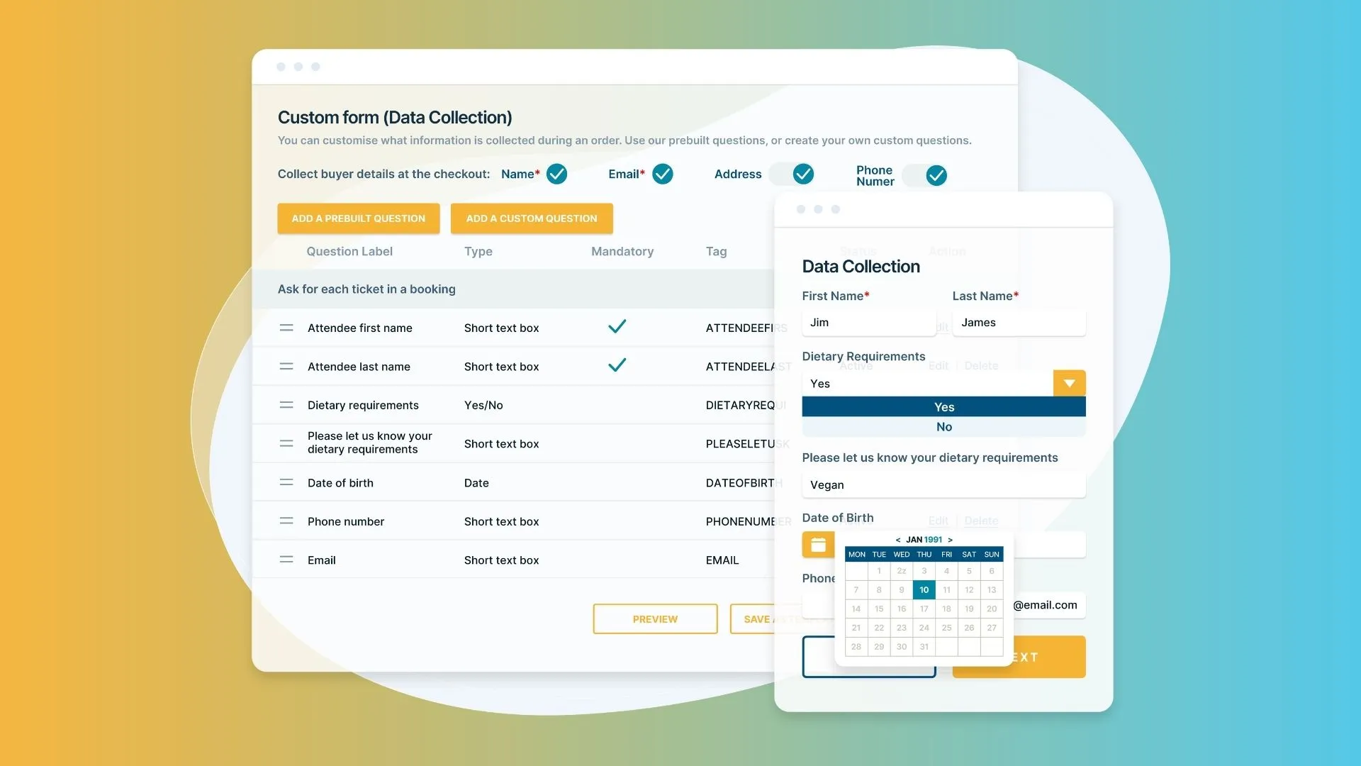
How to Create the Perfect Registration Form Template?
May 11, 2023 · 1 min read
Small business events; Planning, Budgeting, Promoting and Action!
Apr 11, 2017 · 1 min read
How to email your ticket buyers?
Apr 10, 2017 · 1 min read
Why event insurance is important
Apr 04, 2017 · 2 min read
How to plan a successful conference or business event?
Oct 13, 2016 · 4 min read
Learn how schools are using TryBooking to manage events
Feb 23, 2016 · 3 min read
How sporting clubs use TryBooking?
Feb 16, 2016 · 2 min read
The facts about online ticketing that make the difference
Jan 21, 2016 · 2 min read
What else can you use TryBooking for?
Dec 15, 2015 · 2 min read


